JCAD is a family business based in Marseille. A father and son craft and sell objects made from cade wood, a Mediterranean tree known for its scent and its traditional uses, from moth repellent to medicinal properties. Wanting to stand out in a crowded craft market, they came to me to build a professional identity for their brand.
Create an identity rooted in the tradition of wood and the tactile, sun-worn feel of the Mediterranean, while working within a tight printing budget. The goal was an authentic yet modern look, one that avoided the usual "bio" clichés.
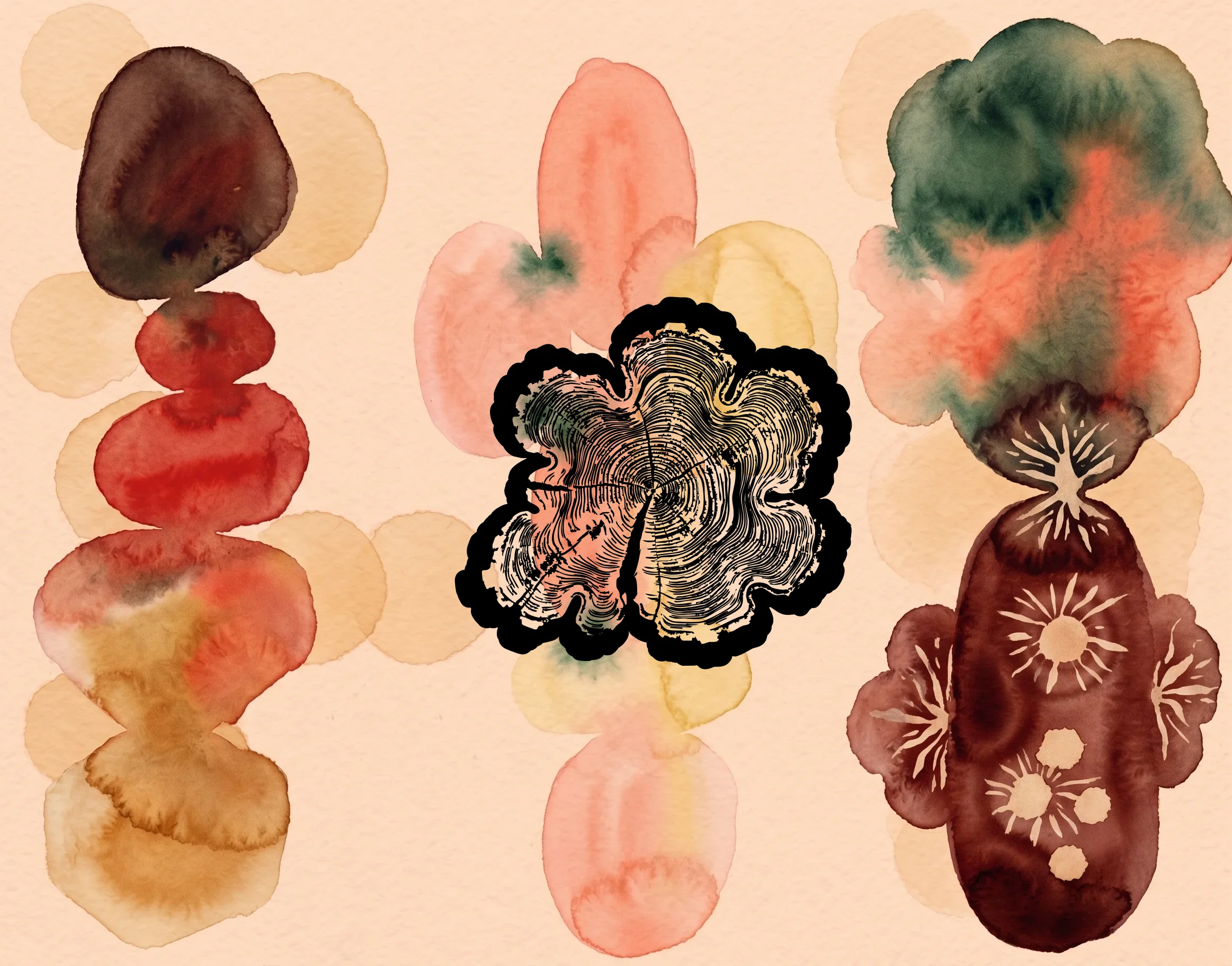
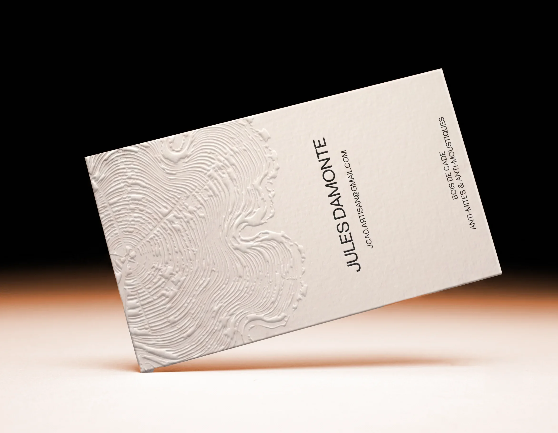
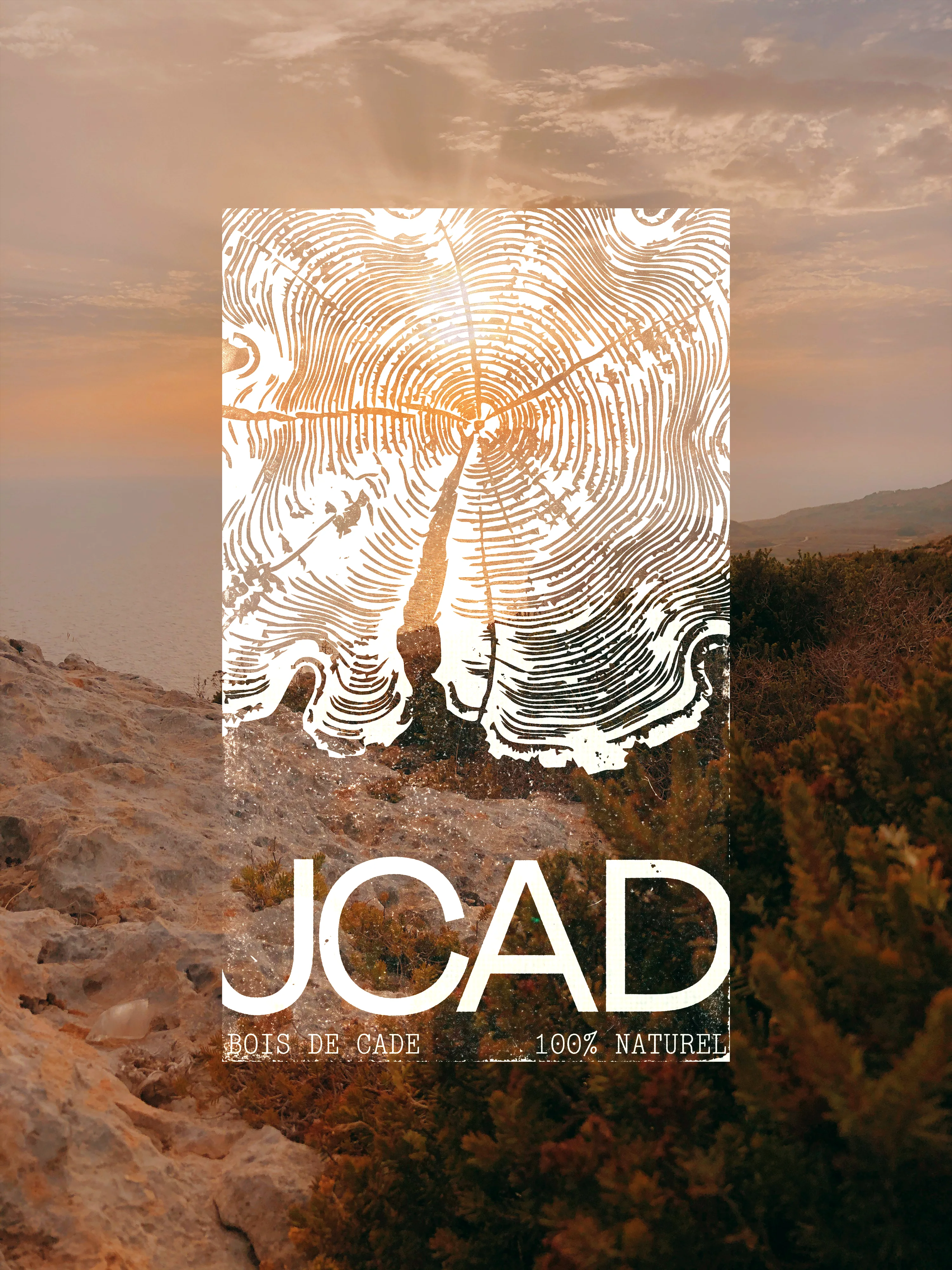
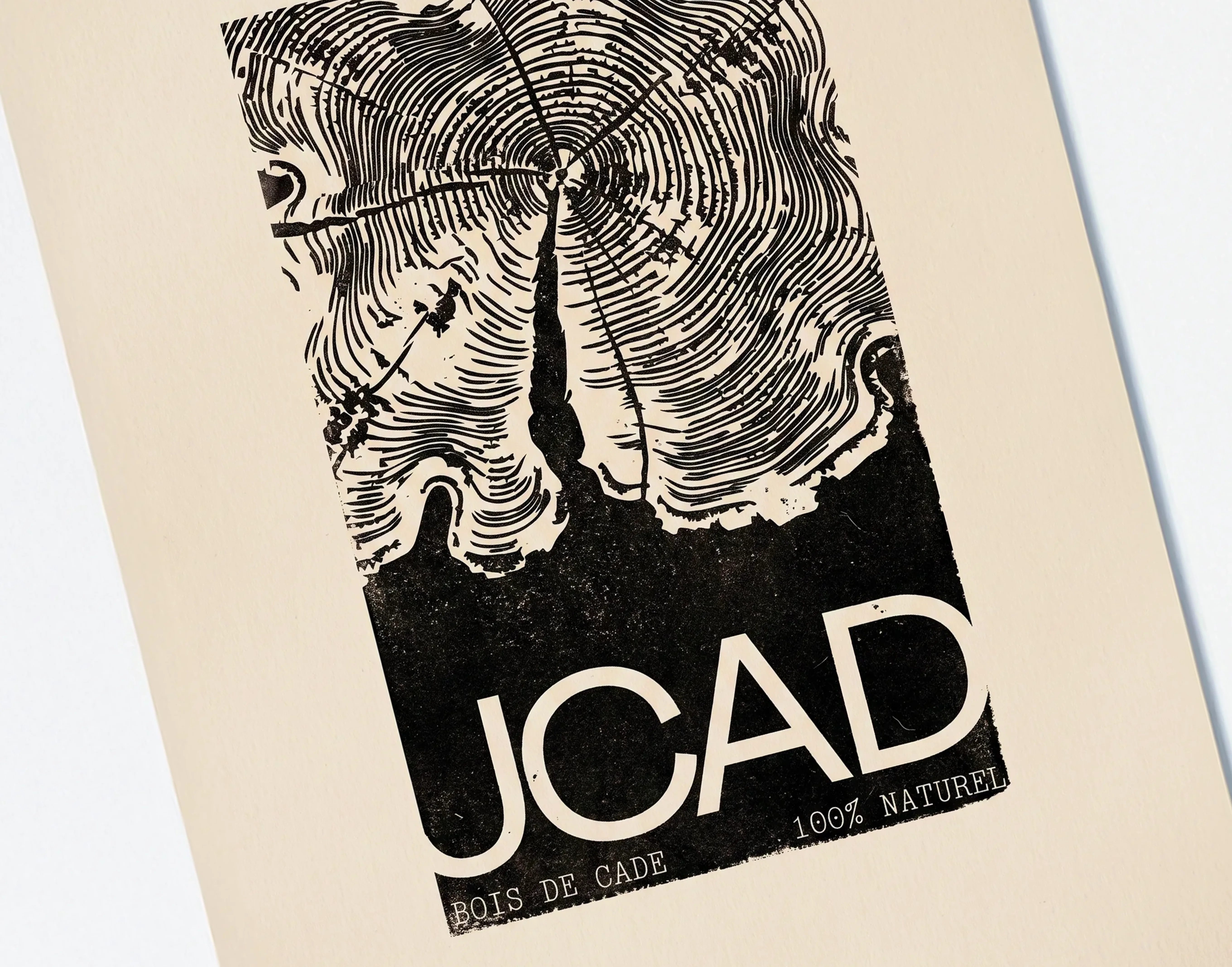
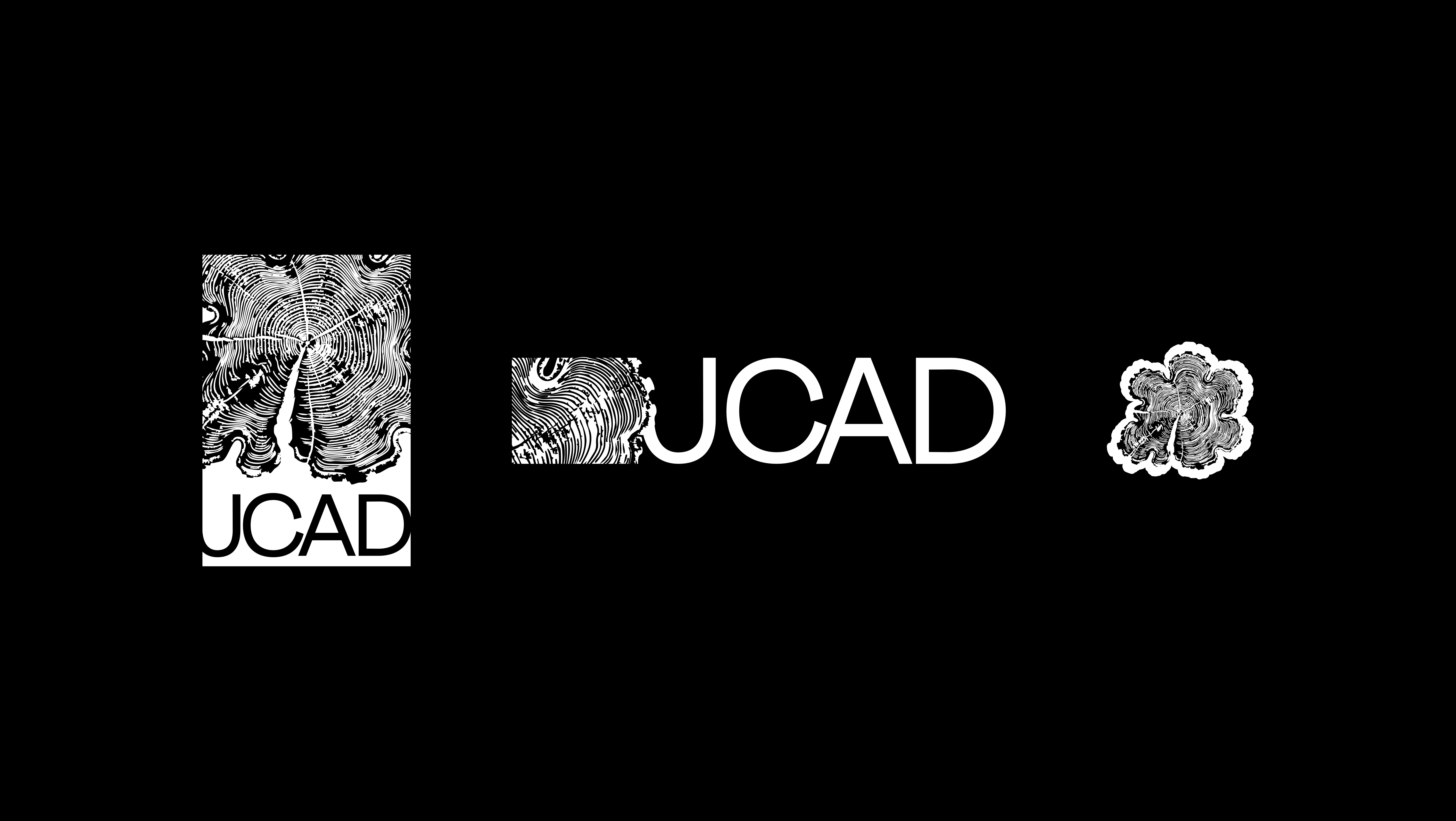
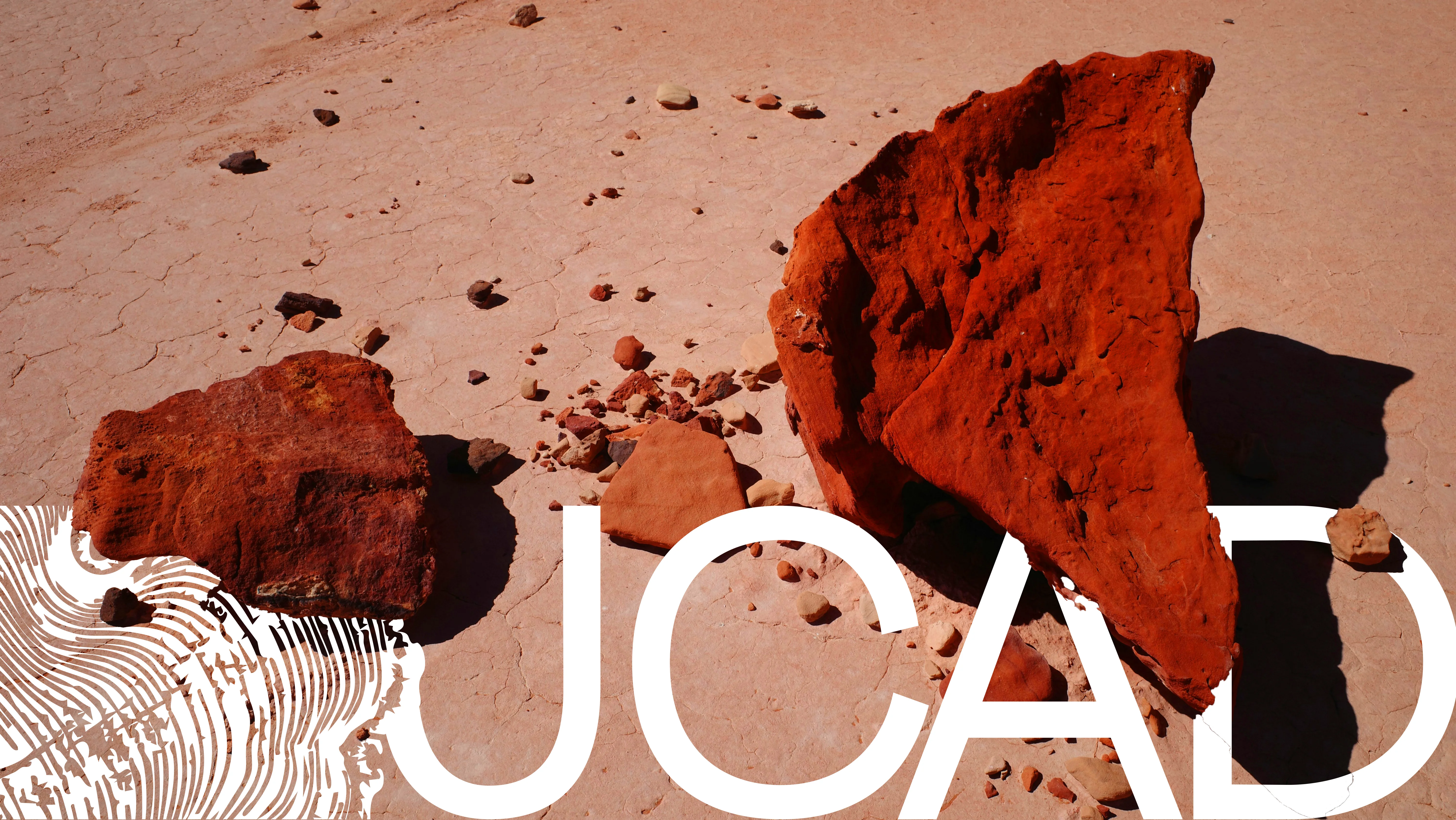
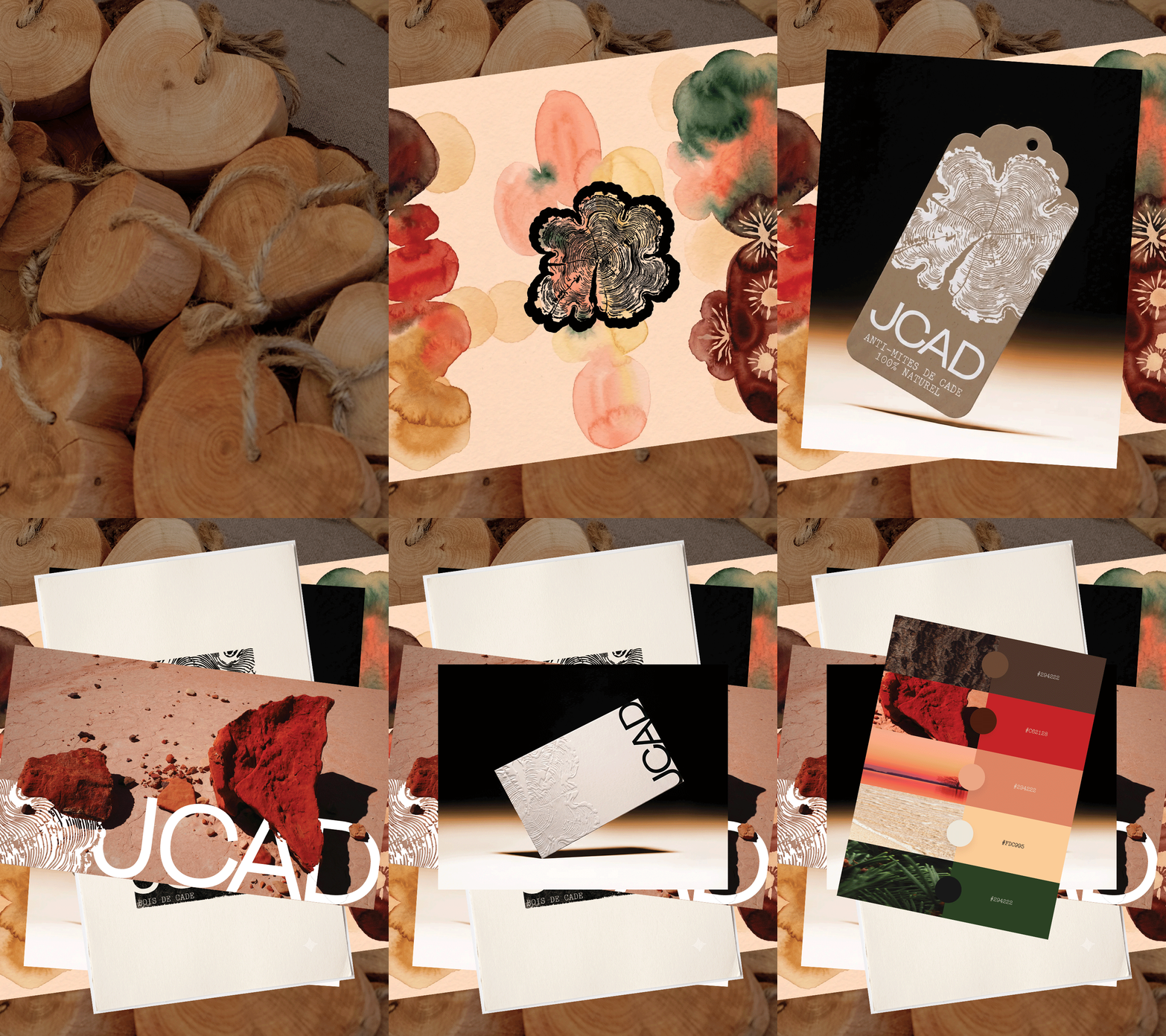
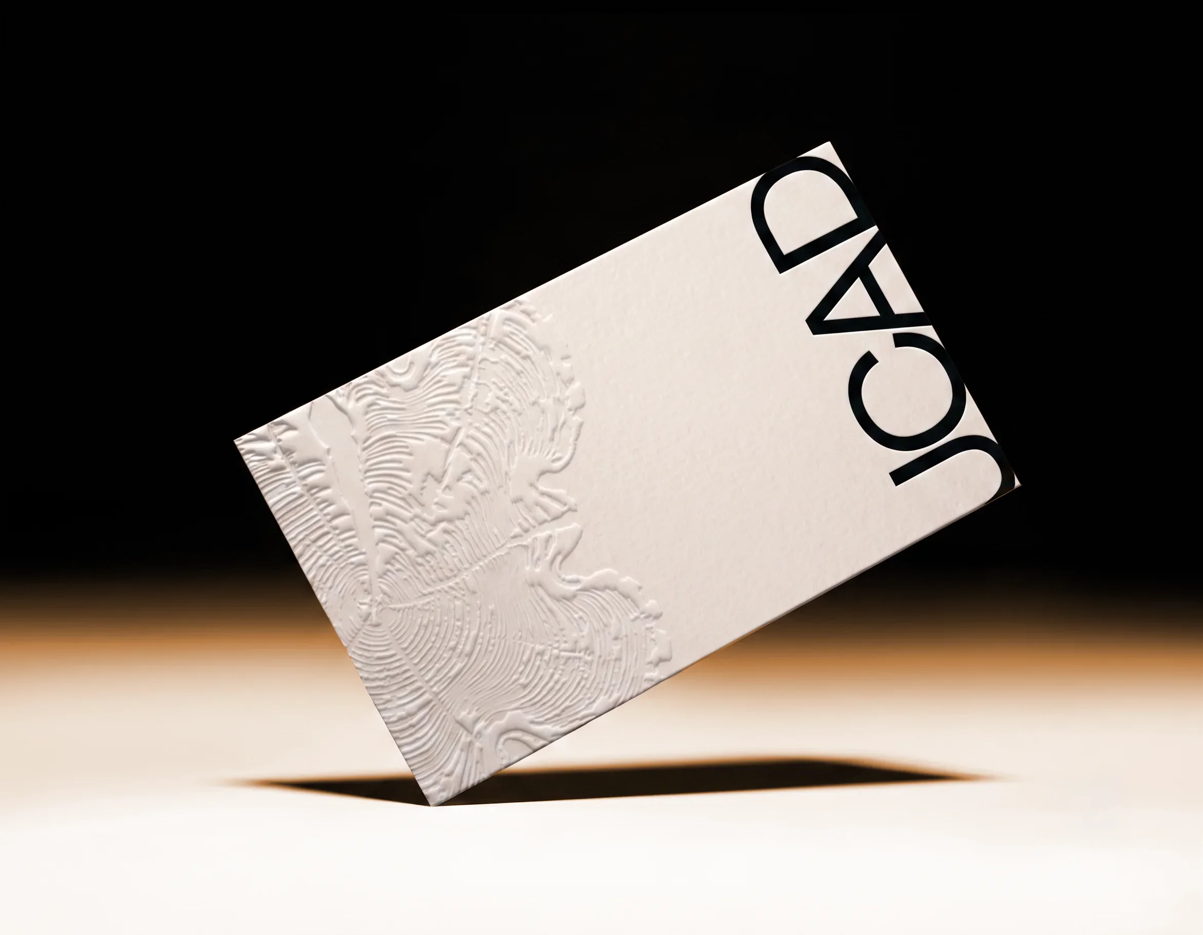
I designed a set of stamps that let the JCAD team print their logo directly onto their products, cards, and labels, adding texture and a handmade quality that fit the craft itself. Inspired by Bryan Nash Gill's wood-grain prints, I built a logo based on a cross-section of wood, in three versions of decreasing complexity for different uses. The logo can be placed on the corners of images, its grain rendered in transparency to reveal the picture underneath. The same shape is subtly embossed on business cards to echo the touch of raw wood. For the color palette, I studied everyday scenes from the Mediterranean coast and mixed them in watercolor, building an extended range of tones that stay warm and harmonious together.